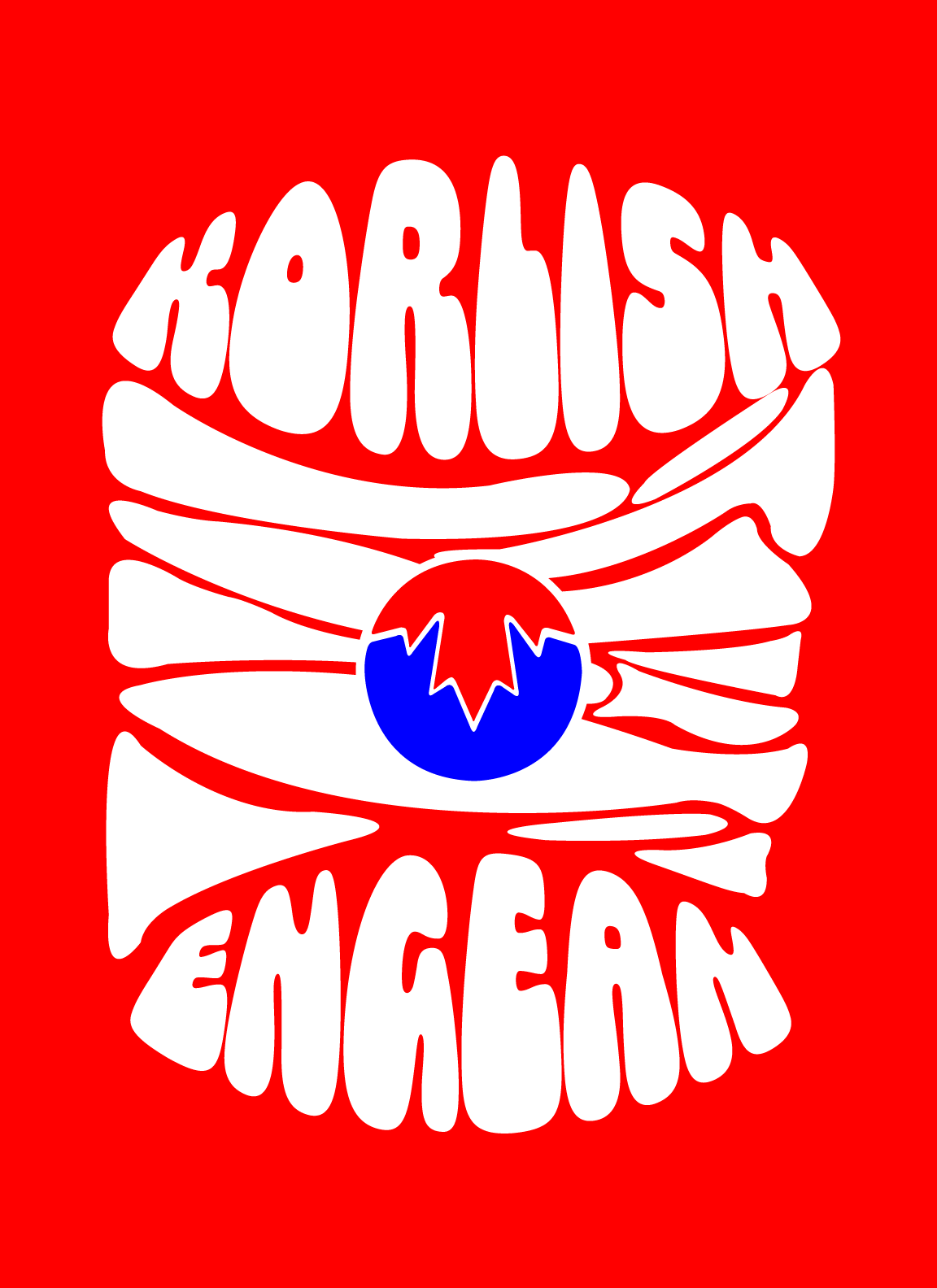
Kong Identity
Branding & Apparel Design
Kong Identity is a clothing line thats goal is to bridge the identity gap that Korean Canadians feel by allowing them to show off and be proud of who they are. The brand focuses on embracing the duo culture and encouraging Korean Canadians to admire their mixed culture to gain a sense of belonging.
Tools
Illustrator, Photoshop, Lightroom, Figma
Skills
Branding, Photography, Screen Printing, Web Design
Duration
Sept 2020 - April 2021
Kong Identity promotes clothing that can be worn comfortably on an everyday basis to allow Korean Canadians to feel comfortable in their own skin.
Neither Korean, nor Canadian.
The brand’s purpose is to create a fusion identity for Korean Canadians to be proud of. Rather than trying to fit into one of the two cultures, Kong Identity creates a new identity by taking KO from Korean and NG from English and meshing them together.

The Logo
The logomark is the company name in a bubbly font, where the “O” in Kong is replaced by a symbol that mixes the Korean and Canadian flag into one. The bubbly font is to contrast the heaviness of the issue being tackled. Our brand encourages its users to handle this hard situation with a light heart, like the typeface shown in the logo. This is also shown in the smiley design, to evoke happy emotions and remind everyone to embrace themselves and smile :)

Language, Food, and Music
The Designs focus on three sub-topics that are crucial in one’s culture. Fusion foods, mixed music, and bilingualism are ways of countering effects of cultural identity gaps like Homesickness and Acculturation.
The Website
The website is a very simple layout where users can purchase clothing and learn more about the issue at hand. It mimics an online lookbook for the brand.


