Pine
DIGITIZED MORTGAGE LENDING PROCESS FOR HOME FINANCING
Corporate Identity Design
Creative Director: Momo Yang
Team: Elsa Amri, Janet Sohn
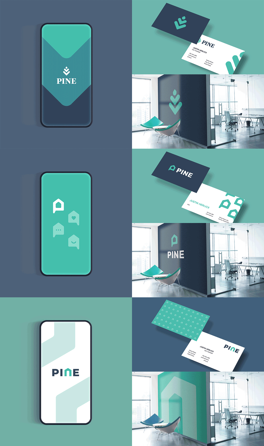
Pine is a digital mortgage company that places clients first and makes home buying a fast and easy process for Canadians. They replaced the hassle of speaking with a traditional bank with a fully online and easy-to-understand application to create a streamlined process. Pine's brand image is trustworthy, friendly, and modern.


Explorations & Concepts
After thorough market research and direction presentation, together with the clients' team, we chose a modern and friendly direction with a memorable mark. This will help Pine feel in tune with the current trends, thus more credible and relatable for the new generation of home owners.


Finalizing The Logo
While the Pine liked our pine cone concept representing their client's growing investments, it had a downside (literally) containing downward arrows, which is not an ideal visual for a mortgage brand. Thus, we decided to switch it around (again, literally), and create a pine tree mark containing upward arrows. The mark's color scheme is warm, pleasing to the eye, friendly without being over the top. Completed with an accent of yellow circle to represent warm light inside the window of a home.


